How to create better ads with Creative Insights
Create better ads with Madgicx’s Creative Insights:
- Test all ad formats and understand which ones work best
- Identify scalable and overspending creatives in your account
- Follow performance trends to avoid ad fatigue
- Understand which elements in your creatives drive the best performance


Creatives are core to your ads because they grab the attention of your audience and are the window to your product. Without good creatives your ads will tank. So you need to be able to analyze which creatives work and which don’t.
Creative Insights is your go-to tool to monitor the performance of the creatives you use in your ads. Here you can see which creatives you should scale or replicate for other ad campaigns and which you need to stop using. You can find Creative Insights in the 360° Meta Audit page in the menu at the top of the screen.
The tool gives you an overview of the performance of different formats, individual creatives, trends, and even the visual elements you include in your creatives.
As always, start by setting the time frame to see the data for your creatives.
Note: the longer the time frame, the more data Madgicx will need to pull from Facebook, which increases loading times.
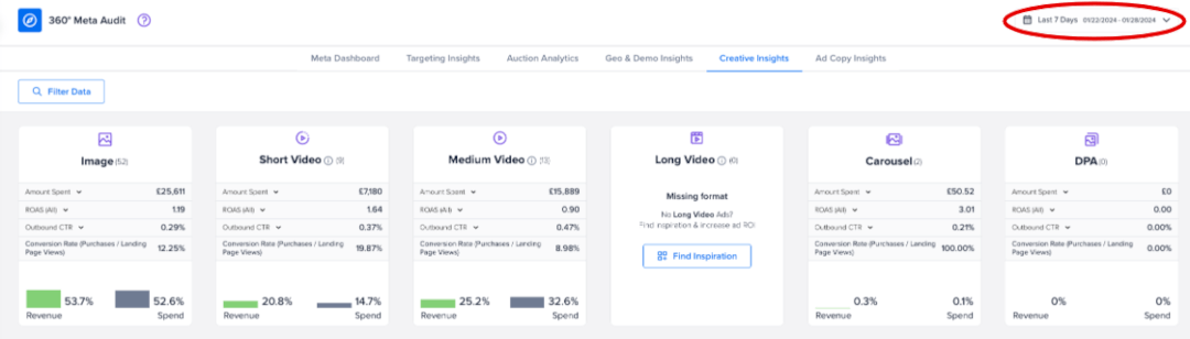
See ad format performance 👀
See which creative formats you are or aren’t using and how they are performing. In the screenshot below, we can immediately see that this ad account isn’t testing long videos.
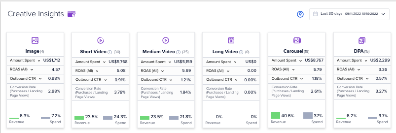
We can also see that our best performing format is the carousel, which brings in 40.6% of the revenue yet takes up just 37% of the ad spend. Meanwhile, DPAs are showing the worst performance: bringing 6.2% of revenue but swallowing up 9.7% of the spend. The insight here would be to invest more in carousel ads and less in DPAs.
The creatives in this account are performing well with ROAS at least 3.36 across all formats in use. If creating long videos is within our team’s bandwidth, we should look at testing this.
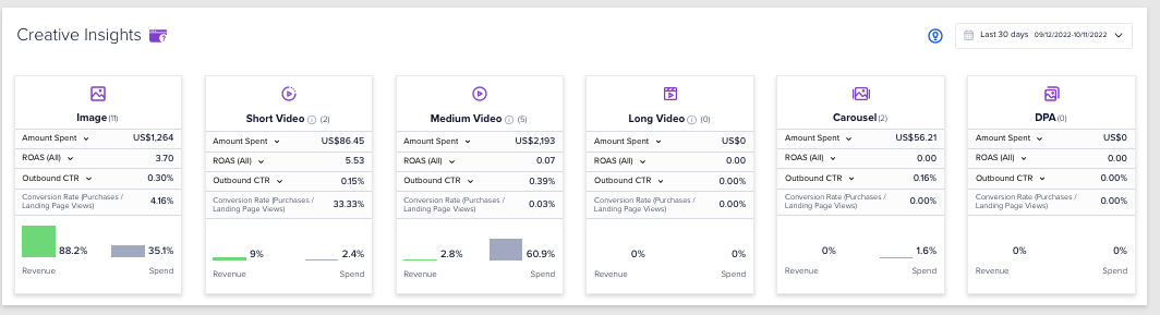
In another example, we can see an account ☝️ that is massively overspending on videos of medium length, while underspending on short videos and images, which are pulling in the revenue.
Identify what’s working 🕵️
Madgicx’s Creative Matrix gives you a visual overview of which creatives are performing well and should be scaled, plus shows those that are overspending and underperforming (and should be turned off).
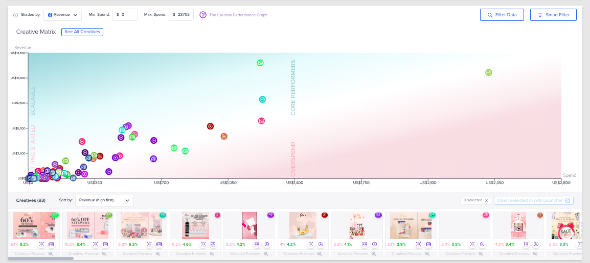
When the graph view is set to revenue vs. spend (like in the account above), we want all of our creatives to — as a minimum — be in the white zone and preferably in the green zone.
The green zone includes:
- Scalable ads that are performing well and you should increase ad spend on
- Core performers that have demonstrated good results over time and still have some mileage in them
The red zone (overspend) includes ads that are not performing well for the money you are spending on them and should be cut.
One thing to remember: expect performance to fall over time as ad fatigue sets in.
In the bottom left of the graph we have the “Getting started” quadrant, showing ads which are mostly new with little spend and little revenue.
When testing different creatives within the same ad set, Facebook will allocate almost the entire budget to one of them, leaving the others with very little budget (and few results). This is why some ads will be on the far-right end of the graph, and the majority will be in the "Getting Started" quadrant.
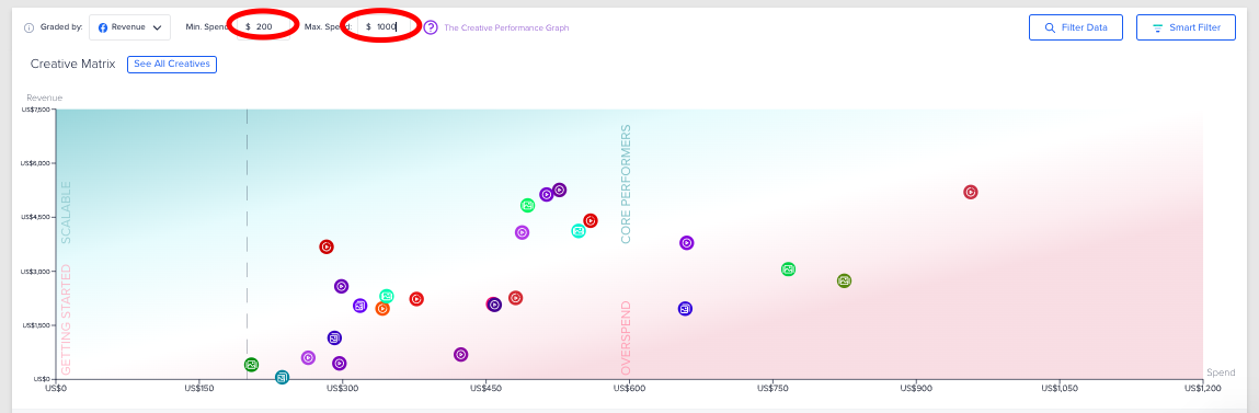
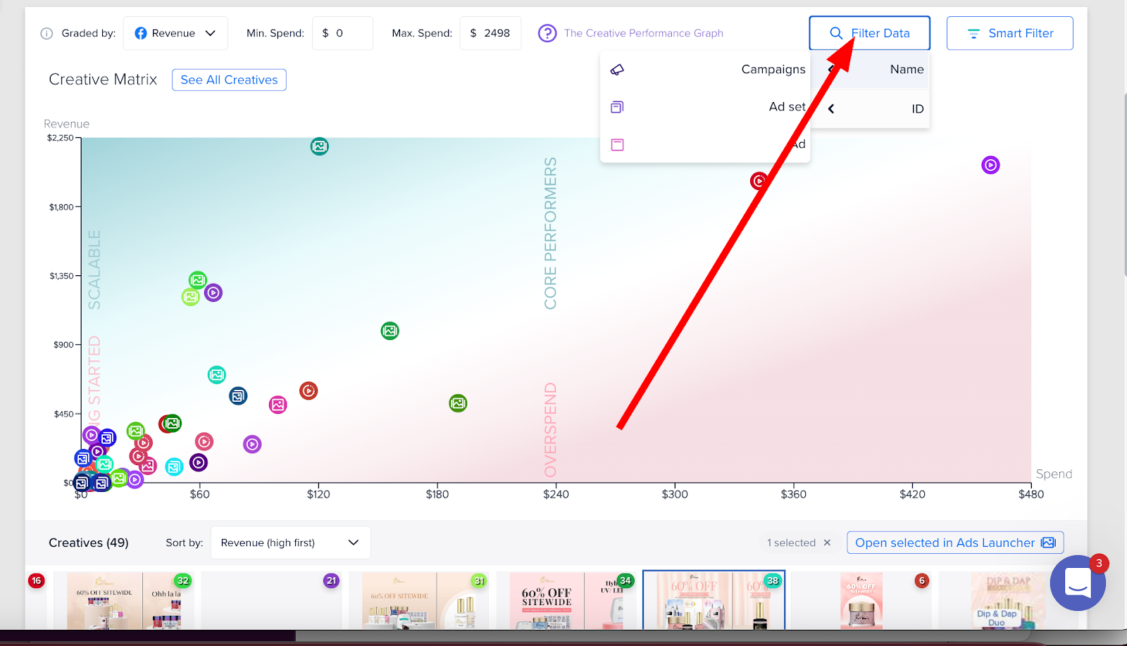
In the screenshot above, we have applied filters in order to get a better look at specific parts of the graph. This helps keep outliers from making the graph hard to read. As you can see, we have:
- Set a minimum spend to find ads that have already spent a certain amount
- Set a maximum spend to find ads which may not have been running for so long
It’s a good idea to set this minimum spend to around double our cost per purchase to ensure the ad gets a fair chance to drive sales.
Then, hover over creatives on the graph to get their individual performance breakdowns:
.gif)
Or hover over individual creatives below the graph to highlight their position on the graph and provide you with an overview of their performance:
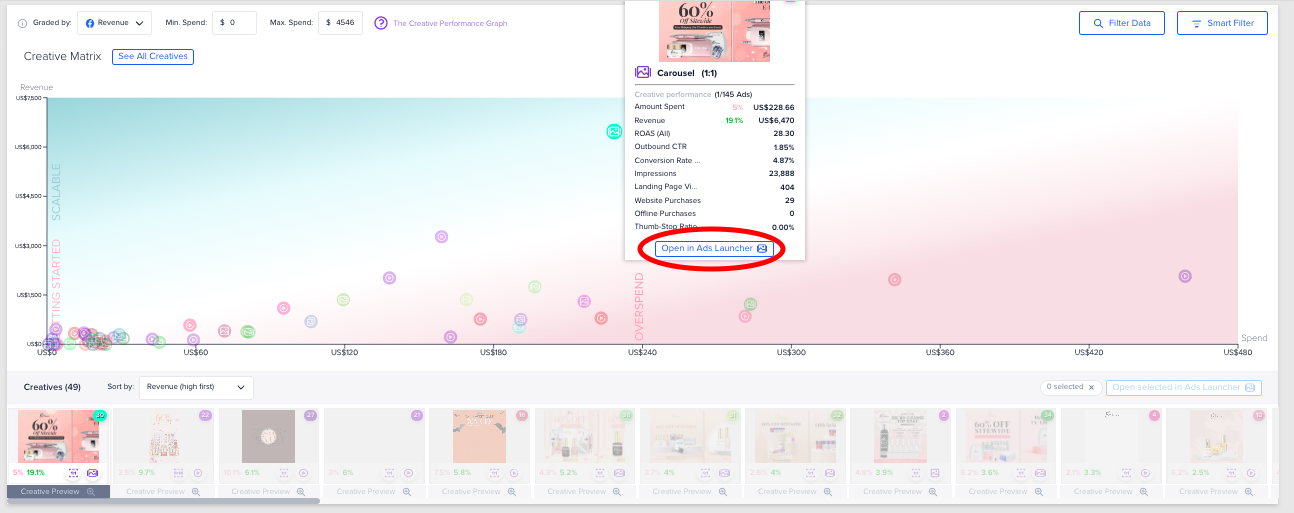
In the screenshot above, we can see that this carousel ad is outperforming all of our other ads with a whopping 28.30 ROAS. We can learn from the style, messaging, and format of this ad to generate more successful ads in the future.
Оnce we spot a scalable ad, we can launch it into additional ad sets to double-down on our success. You can launch ads right from Madgicx by clicking the creative in the graph and then clicking the “Open in Ads Launcher” button.
Get breakdowns
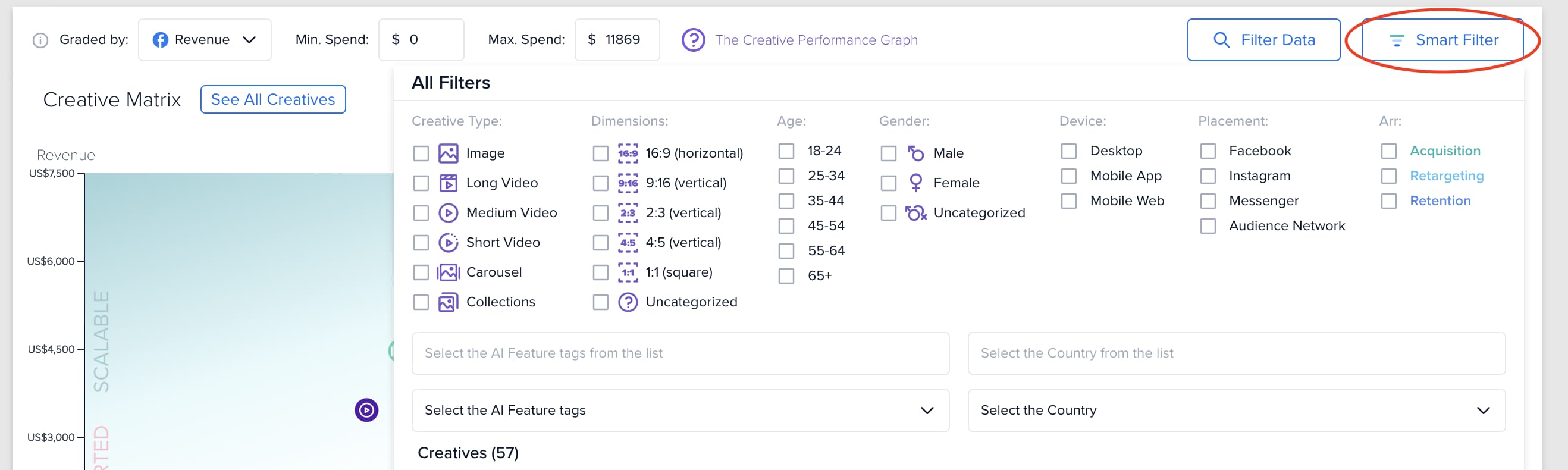
If you want to see performance breakdowns for specific demographics, funnel stage, country, device, placement, and even creative type and dimensions, you can do so by using Madgicx's Smart Filter.
The Smart Filter allows you to:
- Brief creative teams on how to tailor creatives to specific audience segments
- Use specific creatives in ad sets that target the audience they resonate most with
- Focus on the placements and devices that drive the most revenue
You can see how specific creatives are performing for different age ranges and gender at different funnel stages, which means you can laser in on what works for specific cross sections of your audience and then tailor creatives to target specific audience segments.
This is important because your overall ROAS could seem low for all demographics, but then — for example — if you take a look at performance for specific age groups: your ads are killing it. You can then focus your targeting, messaging, and creatives with this group in mind.
Uncover performance trends 📈
Get an overview of the performance trends for your creatives in Creative Performance Trends. If you think you’ve found some scalable ads, here you can make sure they're still trending. If their trend is positive, it's time to scale them. If it's negative, don't waste any more money on them.
You can hone in on specific creatives by selecting the ones you would like to compare in the right-hand column of this widget.
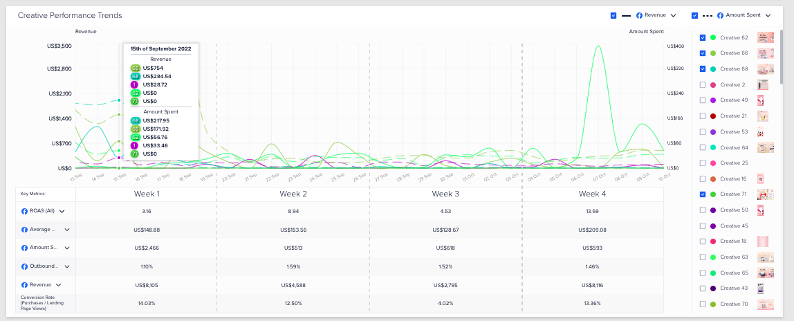
You can see and compare your creatives week-on-week performance for your chosen metrics (select in left-hand column).
Remember, the matrix above only shows the overall performance for the selected time frame. If you select a time frame of 30 days or above, it's crucial to check the performance in the last couple of days before making a scaling decision.
The same goes for overspending ads. Before you turn them off, it'd be good to check their trends. If they have suddenly experienced a recovery in the past couple of days, give them another chance. If the trend is still negative, it's time to pause them.
Replicate what works 🙌
Sometimes you need to know what visual elements work best for your creatives so you know what visuals to include in them. This is where the AI Feature tags come in.
Object identification technology extracts each element you use in different creatives (including both images and videos) and analyzes the performance of each element.
The tags are given a percentage value which reflects your total revenue (in green) from this tag and the percentage of your ad spend for the tag (gray bar).
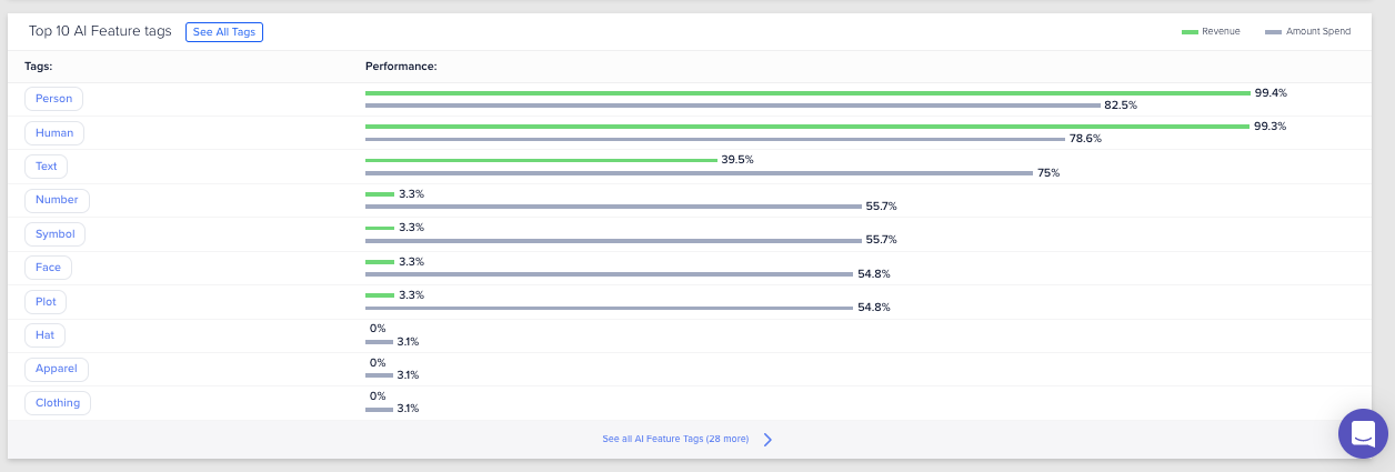
In the screenshot above, we can see that creatives that feature people bring the best revenue, so we will continue to use human beings in our creatives.
There is overlap between some of the tags (i.e., in the screenshot above: 99.4% show a person and 99.3% show a human) since the content of different ads can contain similar elements.
Click on the “See All Tags” button to learn about the elements you are using less in your creatives, but have shown good revenue-spend potential.
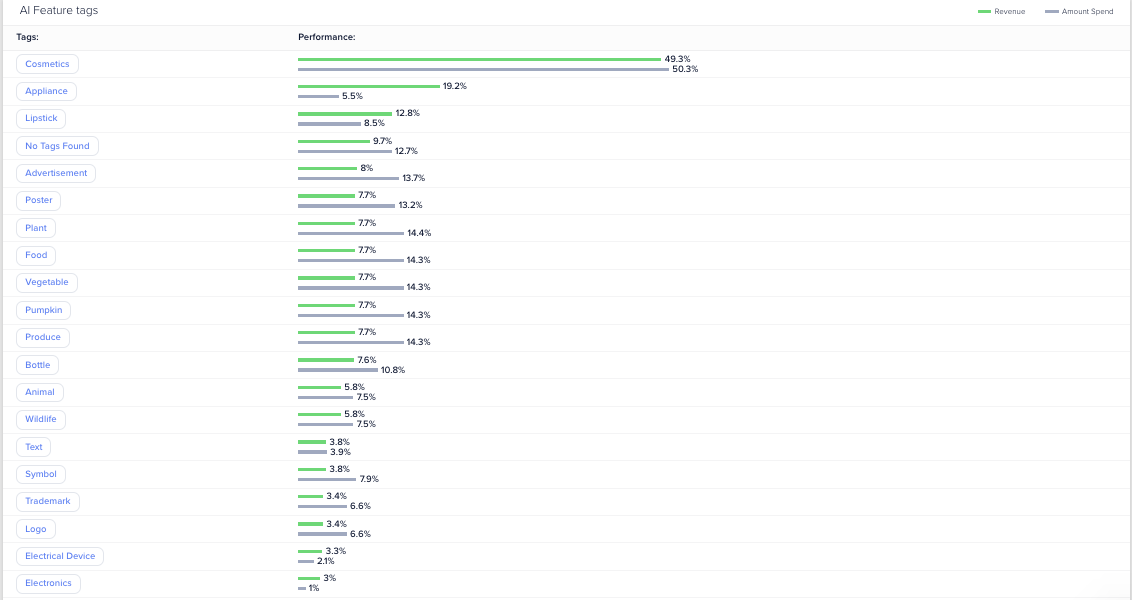
In the screenshot above, we can see which elements perform best for us in our ads and we can look to use these elements in future ads to test what works well.
Our best performing element is the inclusion of an “Appliance” which accounts for 19.2% of the ad revenue, yet just 5.5% of the spend. We should look to include more appliances to test this hypothesis.
Difference with Facebook Ads Manager
Madgicx’s Creative Insights makes you a better media buyer by saving you time with data unification and views that are not available in Facebook Ads Manager.
Can I use Creative Insights to create reports for my clients?
You can screenshot the insights you find in the Creative Insights tool and send them to your clients.
How can I analyze creatives from specific campaigns, ad sets, or ads?
You can see creatives from specific campaigns, ad sets, or ads by filtering the data and entering the relevant name or ID.
How do I quickly know the creative format performance?
Madgicx uses a relative comparison of revenue and spend.

If your business tracks the revenue data in FB, we help you grasp the creative-format performance by giving a quick overview of the share of these values against your overall revenue and spend.
The KPI that I want to select is not available. What should I do?
Can I see data for creative performance by funnel stage (acquisition/retargeting/retention)?
Use the “Smart Filter” in the top right of the Creative Matrix to view segment creative performance by funnel stage.

Why do I need to wait for my data to load?
The loading time depends on the amount of data Madgicx needs to pull from Facebook. This means that loading data views for longer time frames days involves pulling more data and will increase the loading time.
What does the number of creative (e.g., Creative 30) mean?
Madgicx internally classifies your creatives and we use numbers as reference. You can find the full list of creatives by clicking on the “See All Creatives” button or by clicking on the previews.

What do the percentages mean in the AI Feature tags?
The AI Feature tags are given a percentage value which reflects your total revenue (in green) from this tag and the percentage of your ad spend for the tag (gray bar).
Why do the numbers in Creative Insights differ from the ones in the Dashboard and Ads Manager 2.0?
The numbers in Creative Insights can differ from the ones in the Dashboard and Ads Manager 2.0 because Creative Insights pulls data from Facebook Ads just for ads. Meanwhile, the Dashboard and Ads Manager 2.0 pull numbers from campaigns and ad sets.
How can I launch new ad combinations into existing ad sets?
Launching new Ad combinations into existing ad sets/campaigns is made simple with Madgicx using Creative Clusters 💪
The first step is to head to creative clusters section which can be selected from the Launcher tab.

This Table displays all of the ad account’s creatives in the first row.
In the first column on the left are all of the ad accounts' ad copies (the ad text). The rest of the table displays if there is an existing combination of the creative and ad copy for each intersection and you can generate new and existing combinations of ads to existing campaigns and ad sets in one click.
You can control which ads creatives and copies are shown by adjusting the time frame: ads that were active at that time will be shown.
How to find top creatives
Our color-coding system helps you track your best performing ads.

Dark green as the best performance
Light green as good performance
Light pink as bad performance
Dark pink as the worst performance
Choose a KPI from the drop down to set what the performance is based on.
Control displayed ads
Discover ads by how much they spent, set a value and it will only display ads that spent more than that value.
The filter allows you to control which ads will be displayed by checking one or more from the creatives types, dimension, age, gender, placement, device, ARR, and country.
Once you've selected your Ads, click the create button on the top right.
Then select where you'd like to apply this creative.
- You can select specific ad sets,
- You can decide to apply your new creative into Ad sets which don't already have that creative combination.
- You can search for a specific ad set you'd like to launch your creatives into using the search bar.

In a few clicks you can launch your new creatives into preexisting campaigns 🙌

How to use the creative performance graph
The creative performance graph is a tool that sometimes goes overlooked by many users when it happens to be one of our most advanced analytical tools that we offer. The chart is a comparison graph of spend vs. revenue displaying each creative's performance allowing the user to easily see the best/worst performing creatives.

- Min spend - input a value to show only ads with higher spend than the entered value
- Max spend - input a value to show only ads with lower spend than the entered value
- Filter - filter which ads will be displayed by checking one or more from the available filters such as: dimension, age, gender, placement, device, ARR segment, and country

AI feature tag
Within the filter tab, you will see an option named "AI Feature Tag." This is feature allows you to analyze components of creatives and filter creatives based on specific elements. Our software will automatically recognize and tag all creatives elements such as: clothing, animals, weather, indoor/outdoor, materials, electronics, expressions, etc.
This allows the user to see and filter based on these specific components and better understand them as KPIs.
Hover over individual creatives along the bottom or on individual points on the chart to see more detailed information on how individual creatives are performing.
Use this information to decide what advertising tactics to use when producing new creatives.

Launch ads from Creative Insights using creative clusters
You can open selected ads directly into the creative cluster chart from the creative insights page. This allows you to pick and choose the best combination of creatives and ad copies for any of the selected ads.

You can sort your creatives along the bottom of the creative performance graph based on specific KPIs such as:
- Revenue - high first
- Revenue - low first
- Amount spent - high first
- Amount spent - low first
- Creative type
- Creative ratio

Produce more creatives for testing and level up your creative game with Sparkle:
✅ Wide range of design types — from ads to website images
✅ Lightning-fast turnaround time (1–2 days)
✅ High-quality and consistently on-brand creatives
🤔 Not convinced? Try it for free!


Didn't find what you were looking for?
Try our FAQ
Check out the answers to our most frequently asked questions. If you can’t find the answer there, you’ll be able to contact our support team.